Michael Haffenden

UX Design Digital Marketing Research AI Prototyping

Designing and building meaningful digital experiences that connect people, solve problems and drive results.

  1. Real problem
  2. Research
  3. Design
  4. Prototype
  5. Real feedback
  6. Iteration

Selected work

Four projects spanning usability research, product design, AI prototyping, and digital strategy.

UX research · Service design

Booking Friction at Ford Salon

Testing revealed that every participant abandoned booking when asked to provide a credit card before trust had been established.

5/5 abandoned at the payment step.

  • 5 participants
  • Existing booking flow
  • Prototype validation

Challenge

The salon needed a way to protect against no-shows, but requiring a credit card during online booking created significant friction. The challenge was finding a way to meet the business need without creating a barrier that caused new clients to abandon their booking.

Research

Moderated usability testing with 5 participants (ages 35–55) booking a haircut online on the live site.

Insight

Participants did not object to the salon itself. They stopped because the upfront card requirement appeared before enough trust had been established.

Business constraint

Mandatory cards help reduce no-shows and protect revenue. Removing the requirement entirely could increase cancellations. The redesign had to respect both sides.

Solution

Remove the card requirement for first appointments, then require a card on file for returning clients—building trust first while preserving protection against no-shows.

Validation

Existing flow 5/5 abandoned

Mandatory upfront card. Abandonment at payment.

Simplified prototype 5/5 completed

Lower first-visit friction. No abandonment observed.

Simplified first-visit flow

No card required up front. Payment due at the appointment. 5/5 completed.
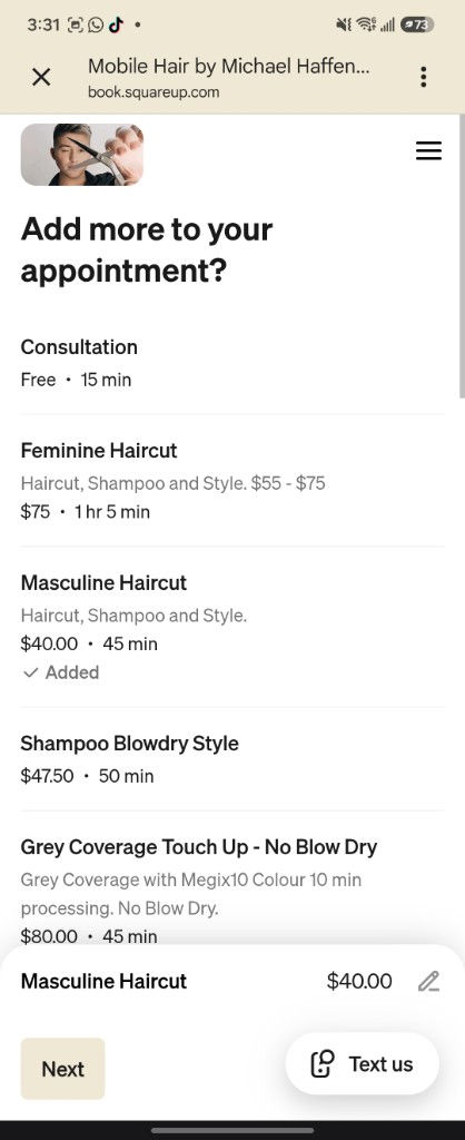
Simplified booking: select or add services
Services Choose a service and continue.
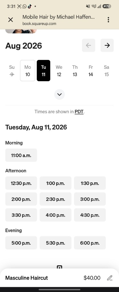
Simplified booking: pick a date and time
Date & time Available slots for the selected service.
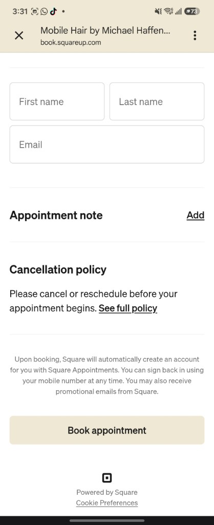
Simplified booking: enter details and book without a card
Confirm Contact details only—no card asked.
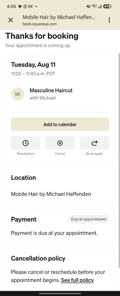
Simplified booking: confirmation with payment due at appointment
Booked Payment due at the appointment.

What I’d test next

  1. Pilot the first-visit flow Test the revised experience with new bookers on the live site.
  2. Run an A/B test Compare it against the current mandatory-card path.
  3. Measure both outcomes Track booking completion and no-show rates together.

Reflection

Good UX here wasn’t “remove the friction.” It was finding the smallest change that helped users finish while still protecting the business.

Coach Me home screen with snap-your-food prompt, daily reflection, and calorie plan
Product · AI companion

Wellness App

Designing an AI-assisted wellness experience around one user’s real daily habits.

Designed and iterated with one primary user who had experience with Formula. She found the AI camera, calorie estimates, and macro breakdown easier to use and continued using the app beyond testing.

  • 1 primary user
  • Multiple iterations
  • AI meal recognition
  • Live PWA

Tools: HTML/CSS/JS · PWA · AI meal vision · Netlify

Challenge

Could I build a wellness app comparable in quality to an established product, while making it easier and more personalized for a real user? The challenge was turning her feedback into a simpler experience while exploring how AI could make everyday tracking easier and more useful.

Research

Primary user: Pelma, an experienced Formula user who found calorie tracking overwhelming and frustrating. She used this product over multiple iterations, compared it against her existing routine, and her feedback directly shaped what shipped next.

The experience

The product journey in four moves.

  1. Personalize the plan Learn goals, routines, and preferences.
  2. Log food with less effort Photograph meals and confirm the AI estimate.
  3. Adapt throughout the day Calories, movement, and suggestions update together.
  4. Receive supportive coaching Daily insights reinforce progress without guilt.

Screens

Each screen does one job in that journey.

Coach Me onboarding welcome screen
Onboarding Learns goals and preferences before setting a simple plan.
Personalized wellness plan with food style, movement, daily targets, and focus
Your plan Starting targets for food, movement, calories, protein, and water.
Snap your food screen ready to open the camera
Snap food Open the camera to log a meal with AI.
Meal detail with nutrition breakdown
Meal details Calories and nutrition breakdown before logging.
Daily dashboard with calories, macros, water, and snap food actions
Dashboard Calories, macros, water, and quick actions in one view.
AI coach insights screen
Daily insights Personalized AI coaching with optional voice playback.
Movement tracking with mood and energy plan
Activity tracking Exercise adjusts the daily calorie budget without shame language.
Weekly progress and wellness score
Progress Trends, weekly score, and gentle check-ins.

Validation

The primary user tested the app alongside Formula and preferred this app’s simpler experience, particularly its meal recognition and presentation of estimated calories and macros. She continued using it consistently as part of her wellness routine and made progress toward her personal goals, including weight loss.

Reflection

This project reinforced that wellness products are not only about tracking data. They also need to reduce effort, support motivation, and adapt to how people actually build habits.

Client work · Digital marketing

Real Estate Lead Generation System

An end-to-end lead journey for court-ordered and foreclosure opportunities—from Meta campaign through landing page, CRM intake, and follow-up.

  • Live client deployment
  • Meta campaign ready
  • Lofty CRM integration
  • Brokerage-compliant messaging
Polished desktop landing page with hero promise and lead form
Landing page Conversion-focused desktop experience for court-ordered sale alerts.

Built the full lead journey from Meta campaign to CRM follow-up, with messaging designed for a sensitive real estate category.

Challenge

A local realtor needed a way to generate qualified buyer leads online while working within brokerage advertising requirements and an existing CRM. The challenge was to create a complete journey from first contact through lead capture and follow-up, with messaging that built trust around a sensitive real estate category.

Insight

People researching court-ordered sales may already feel uncertain, so the experience needed to be informative and reassuring without feeling overly sales-driven. Because real estate is a personal service, the tone also needed to remain consistent from the first ad through the landing page, CRM follow-up, and direct conversation with the realtor.

Ongoing client conversations helped refine the terminology, tone, and sales approach across each touchpoint, creating an experience that felt knowledgeable, neutral, and trustworthy.

System flow

  1. Meta ad
  2. Landing page
  3. Short form
  4. Lofty CRM
  5. Automated email
  6. Realtor follow-up

Key decisions

Sensitive category, neutral tone

People researching foreclosures or court-ordered sales may already feel uncertain.

Used clear, reassuring language instead of urgency-heavy or overly promotional messaging.

One voice across the journey

Real estate is a personal service, so the experience needed to feel consistent from first click to direct follow-up.

Aligned the ad, landing page, automated email, and realtor messaging around the same tone and terminology.

Lower friction at first contact

A long form would ask too much too early.

Kept the initial inquiry to essential fields, with qualification continuing through follow-up.

Message continuity from ad to page

Paid traffic works better when the landing experience matches what the user clicked.

Kept campaign messaging, terminology, and visual direction consistent between Meta and the landing page.

Project scope

Beyond the landing page: messaging, compliance, lead routing, deployment, and campaign preparation.

  • Client discovery and positioning
  • Messaging strategy for court-ordered sales
  • Brand voice across the lead journey
  • UX for a short, high-intent lead form
  • Responsive landing page
  • Lofty CRM integration and lead routing
  • Automated follow-up
  • Advertising compliance considerations
  • Meta campaign preparation
  • Vercel deployment and UTM tracking

Current status

The landing page, CRM routing, automated follow-up, and campaign assets are complete. The Facebook page is being prepared before paid traffic begins. Conversion performance will be evaluated once the campaign is live.

Reflection

This project showed that a lead funnel is not just a technical system. In a personal service business, the experience continues after the form is submitted. The ad, landing page, automated follow-up, and eventual conversation all need to support the same promise and level of trust.

Friends watching a Kelowna sunset with a rainbow overhead — Chasing Rainbows welcome art
Product prototype · Community

Chasing Rainbows

Turning Kelowna Into a Queer Treasure Hunt

A location-based community experience that uses hidden treasure, local destinations, rewards, and playful discovery to give LGBTQ+ people more reasons to explore their city and participate in something shared.

The concept grew from conversations with 11 members of Kelowna’s LGBTQ+ community about connection, fragmentation, and belonging. Early field testing showed particular enthusiasm for the treasure-hunt mechanic, helping shift the experience toward a simple question: where’s the next one?

Further testing will explore whether that curiosity and shared participation can translate into a stronger sense of connection to the local community.

  • 11 community interviews
  • 1 initial field test
  • Interactive prototype

Tools: React · TypeScript · Vite · Tailwind · Supabase

Challenge

Local LGBTQ+ community members described fragmented social circles, limited year-round engagement beyond Pride, and a desire for more ways to connect through shared experiences.

Research

11 interviews with local LGBTQ+ community members

Fragmentation

Existing social circles could feel difficult to enter.

Low-pressure participation

People wanted ways to take part without forced interaction.

Shared participation

Connection was often described through doing things together, showing up, mutual support, and chosen family.

Insight

How might we create low-pressure ways for LGBTQ+ people to explore Kelowna and feel more connected to their community?

Solution

Chasing Rainbows turns Kelowna into a community treasure hunt.

Players discover hidden treasure throughout the city, visit local places, collect rewards, and share in an experience they can participate in alone or with others.

Experience principles

Curiosity over obligation

Give people a reason to wonder, “Where’s the next one?”

Shared presence without forced interaction

Participate independently, with friends, or alongside other Chasers.

Discovery that feels rewarding

Make exploring familiar and unexpected places feel playful and worthwhile.

Product mechanics

  • Location-based treasure hunts
  • Hidden treasure throughout Kelowna
  • Collectible rewards
  • Live presence of other Chasers
  • Community chat
  • Storybook-inspired visual design

Product flow

Map → Choose treasure → Follow the clues → Find it → Unlock reward → Find the next one

Chasing Rainbows map and welcome home screen
Map Enter the hunt and see what’s out there.
Treasure list across Kelowna
Choose treasure Pick a hunt to follow.
Treasure brief with location and clue
Follow the clues What, where, and a clearer hint.
Follow the clues map to the treasure
Find it Clue, map, and arrival at the place.
Unlocked reward and collectible keepsake
Unlock reward Featured keepsake plus secondary collectibles.
Me tab with profile and scrapbook of finds
Find the next one Profile, scrapbook, and the next hunt.

Observed field-test journey

What one pilot participant actually did during the first field test, based on real-world behaviour rather than intended product navigation.

  1. Open map
  2. Choose a glow
  3. Travel to location
  4. Follow the clue
  5. Discover reward
  6. Leave a shared note

Field-test findings

One participant completed the initial field test, separate from the 11 community interviews that shaped the concept.

The participant enjoyed the treasure-hunt experience, responded strongly to the rewards, and wanted to keep discovering more. They said they would recommend the experience to others with similar interests.

Some clues successfully led the participant to the general area but were not precise enough to make the final discovery satisfying.

Clues became more specific and rewards became more meaningful, but the larger learning was about the product itself. The participant wasn’t motivated by completing a walk or checking off a quest. The motivation was finding something.

The motivation was not the walk itself. It was the feeling of finding something.

That shifted the concept toward making discovery the core experience: more individual treasures across the city, stronger visual rewards, and a repeated loop built around the question, “Where’s the next one?”

Because this insight comes from a single pilot, it remains an early product hypothesis rather than proof that the experience improves community connection.

What I’d test next

Move from “one person had fun” to repeatable evidence across different users.

  1. Clue clarity Can people understand the clues without help?
  2. Completion Do they successfully find the treasure?
  3. Reward value Does the reward feel worth the effort?
  4. Continued participation Do they want to find another one?
  5. Connection Do they feel more connected to the local LGBTQ+ community afterward?
  6. Reach Does the experience work for people outside my immediate social circle?

Reflection

Chasing Rainbows has strong concept appeal and a distinctive visual world, but it is still an early-stage prototype with limited field evidence. Community interviews shaped the original direction, while the first field test revealed that the strongest motivation was not simply going somewhere or completing a quest. It was the feeling of discovering something.

That insight shifted the product toward clearer clues, stronger rewards, and more individual treasures across the city. The next step is broader field testing to see whether different users can complete the experience independently, want to keep searching, and report a meaningful change in how connected or engaged they feel.

Portrait of Michael Haffenden in his workspace

About

I’m Michael. I enjoy solving real problems. I talk to users, build something, test it, and iterate. Based in Kelowna, with a background in brand ambassadorship and client-facing work that keeps me focused on how people actually feel in the moment.

Let’s talk

Open to client experience, marketing, administrative, and junior digital roles in Kelowna or remotely.